How to design a double scroll on web pages
Jun 9, 2019
En este artículo recopilo los resultados de una investigación que hice hace unos años específicamente sobre dobles scrolls, es decir, cuando en una página tenemos un desplazamiento vertical dentro de otro más grande, o incluso conviven desplazamientos verticales con horizontales, cada vez más común en las interfaces actuales. Al final del artículo muestro las medidas que recomiendo usar para estos dobles scrolls para asegurar que se cumplen las recomendaciones que investigué.
Problem
When an iframe is included on a web page or application, the challenge of handling two or more scroll bars arises. This can cause the embedded iframe to unintentionally drag while scrolling through the page, or vice versa. This problem is common on pages containing maps, banking data, lists, scrollable modals, or horizontal scrolls, which are very common on mobile devices.
Exploring recommendations to avoid conflicts between vertical and horizontal scrolling is necessary, as well as possible design alternatives that can completely prevent these problems.
Embedded Scroll Areas
The use of an embedded scroll area imposes extra cognitive load on the user. The user must consider, even before interacting, how that area relates to scrolling in relation to the total page (which may already be scrollable). Having a single scroll throughout the page avoids complications, as it works the way the user expects.
The use of a scroll area can be justified by saving space, allowing the highlighting of elements that might otherwise be hidden at the bottom of a long list. However, this method can also hide important options in favor of others that appear with a single scroll.
Furthermore, we cannot predict the user's screen size, so we may be unnecessarily adjusting the size of these areas. A user with a large screen could see all the elements perfectly.
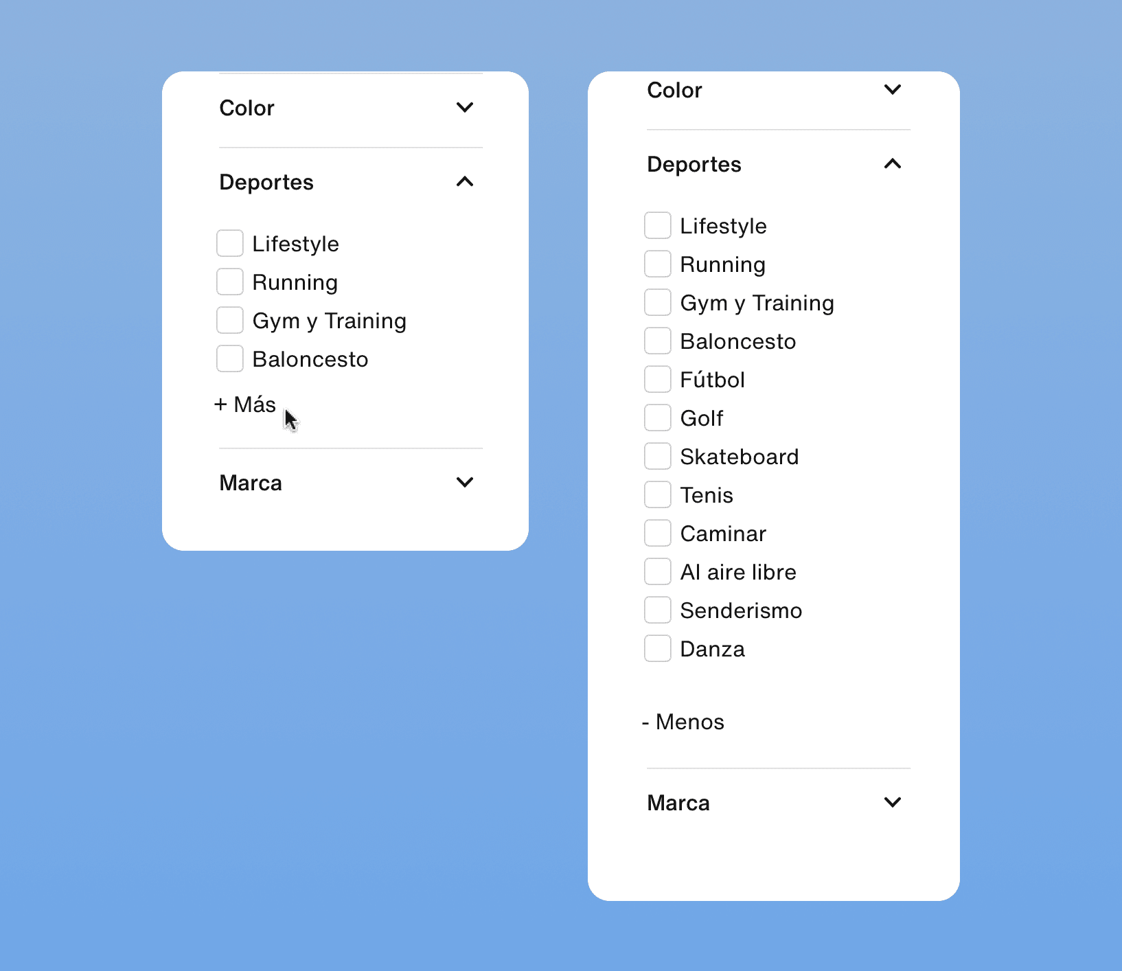
A better solution that saves space without resorting to scrolling is to truncate the elements, i.e., provide a visible "see more" button, as shown in the following example:
A scroll area can trap the user while they scroll, whether using a mouse or a touchscreen. If the mouse cursor enters one of these areas while scrolling through the entire page, the scroll will apply to the area and the page will not move. The same can happen on a mobile device, and is even more critical if the defined area height exceeds the size of the phone screen, preventing complete exit from the scroll area.
Devices often use gestures for navigation, including web pages. For example, a Mac computer allows the user to return to the previous page by making a gesture with the Magic Mouse to the side. On an iPhone, a gesture from the left edge of the screen allows the user to go back to the previous screen. A user may try to scroll horizontally and unintentionally activate a page back. Or vice versa, attempt to go back and not be able to because the scroll has captured their gesture. Undoubtedly, the first case is more frustrating for the user and can cause them to lose their work.
Hiding content behind a scroll area can make the user think that the content they are looking for does not exist. This may not be very evident in a list format, where the user knows they have to review the content, but it may be crucial if this scroll area is used to hide navigation links.
For example, in an ecommerce site that lists categories in a horizontal scroll, the user may think that the category they are looking for is not available because they do not see it among the first 3-4 categories that appear. Or on a page where tabs are used for navigation, on mobile, it is possible that not all tabs are visible and the user tries to find the hidden section.
The user may not realize that this content can be scrolled.
If the user scrolls using the scroll bar, i.e., clicking on it and dragging it both vertically and horizontally, they can skip elements if the bar does not have the sensitivity adjusted correctly. In other words, they can pass through the elements too quickly.
Reflow
There is an accessibility criterion that requires pages to allow seamless zooming without loss of functionality. Generally, when zooming, the page transforms according to the defined responsive design, so that at a zoom level of 400%, what is seen is essentially the mobile version at a large scale.
This criterion specifies that at this zoom level, scrollable content must be visible correctly. Therefore, there must be a definition for these screens in responsive breakpoints, so that they are displayed correctly when zoomed in.
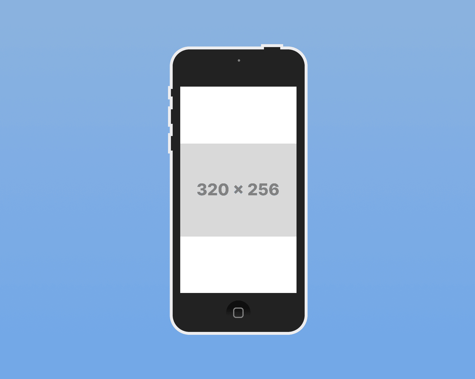
The measures provided by the criterion are based on a standard screen size, with a width of 1280 and a height of 1024. With a zoom of 400%, the width is reduced to 320 and the height to 256.
The criterion specifies that for content with horizontal scrolling, there must be a responsive definition with a height of 256. And for those with vertical scrolling, there must be a responsive definition with a width of 320.
The image shows an iPhone 5 with an original width of 320, along with a 256-height rectangle to indicate the represented area.
All of this is done to avoid scrolling in both directions. An exception criterion is set for content that necessarily needs to have scrolling in two dimensions, such as maps, images, games, and tables. In these cases, it is indicated that the navigation bars must be visible.
Instagram Criterion
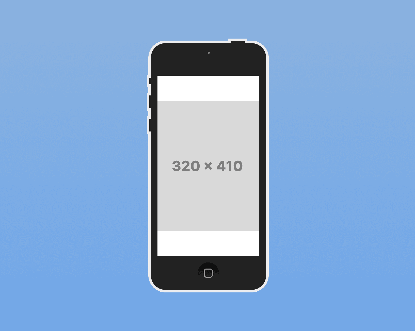
Instagram presents horizontal scrolling in photo carousels on mobile devices of all sizes, and its experience is not chaotic. The size of the photos defined by Instagram for posts, in the case of vertical photos (those that take up more height), is 1080 x 1350 pixels (Instagram displays them at the size of 600 x 749 pixels). If we adapt this photo size to the iPhone 5, we can see that the photo fits on the screen and also leaves space to display content below. In the case of the iPhone with a width of 320, the image adjusts to a height of 410.
If we calculate the minimum height a photo of Instagram can have based on the horizontal size of the photo, which is 1080 x 566 pixels (the size of 600 x 400 pixels can also be used), we get a height of 213 with a width of 320. This is less than the recommended height in the accessibility criterion.
When calculating the minimum height a video of Instagram can have, which is 600 x 315 pixels at the minimum, and with a width of 320, we obtain a height of 168. This is smaller than the previous one and is below the accessibility criterion. It can be argued that this criterion is for responsive web and not for applications in which the content has a fixed size, except for text, so it will not be affected by a zoom.
Conclusions
An element with scrolling on the web must have a minimum height of 256 and a maximum of 410 in its mobile version, pending testing.
An element with scrolling in the application can have a minimum height of 168 and a maximum of 410 in its mobile version, pending testing.
Useful Links
Embedded Scroll Areas
Design truncations:
Interaction Design
How to design a double scroll on web pages
Jun 9, 2019
En este artículo recopilo los resultados de una investigación que hice hace unos años específicamente sobre dobles scrolls, es decir, cuando en una página tenemos un desplazamiento vertical dentro de otro más grande, o incluso conviven desplazamientos verticales con horizontales, cada vez más común en las interfaces actuales. Al final del artículo muestro las medidas que recomiendo usar para estos dobles scrolls para asegurar que se cumplen las recomendaciones que investigué.
Problem
When an iframe is included on a web page or application, the challenge of handling two or more scroll bars arises. This can cause the embedded iframe to unintentionally drag while scrolling through the page, or vice versa. This problem is common on pages containing maps, banking data, lists, scrollable modals, or horizontal scrolls, which are very common on mobile devices.
Exploring recommendations to avoid conflicts between vertical and horizontal scrolling is necessary, as well as possible design alternatives that can completely prevent these problems.
Embedded Scroll Areas
The use of an embedded scroll area imposes extra cognitive load on the user. The user must consider, even before interacting, how that area relates to scrolling in relation to the total page (which may already be scrollable). Having a single scroll throughout the page avoids complications, as it works the way the user expects.
The use of a scroll area can be justified by saving space, allowing the highlighting of elements that might otherwise be hidden at the bottom of a long list. However, this method can also hide important options in favor of others that appear with a single scroll.
Furthermore, we cannot predict the user's screen size, so we may be unnecessarily adjusting the size of these areas. A user with a large screen could see all the elements perfectly.
A better solution that saves space without resorting to scrolling is to truncate the elements, i.e., provide a visible "see more" button, as shown in the following example:
A scroll area can trap the user while they scroll, whether using a mouse or a touchscreen. If the mouse cursor enters one of these areas while scrolling through the entire page, the scroll will apply to the area and the page will not move. The same can happen on a mobile device, and is even more critical if the defined area height exceeds the size of the phone screen, preventing complete exit from the scroll area.
Devices often use gestures for navigation, including web pages. For example, a Mac computer allows the user to return to the previous page by making a gesture with the Magic Mouse to the side. On an iPhone, a gesture from the left edge of the screen allows the user to go back to the previous screen. A user may try to scroll horizontally and unintentionally activate a page back. Or vice versa, attempt to go back and not be able to because the scroll has captured their gesture. Undoubtedly, the first case is more frustrating for the user and can cause them to lose their work.
Hiding content behind a scroll area can make the user think that the content they are looking for does not exist. This may not be very evident in a list format, where the user knows they have to review the content, but it may be crucial if this scroll area is used to hide navigation links.
For example, in an ecommerce site that lists categories in a horizontal scroll, the user may think that the category they are looking for is not available because they do not see it among the first 3-4 categories that appear. Or on a page where tabs are used for navigation, on mobile, it is possible that not all tabs are visible and the user tries to find the hidden section.
The user may not realize that this content can be scrolled.
If the user scrolls using the scroll bar, i.e., clicking on it and dragging it both vertically and horizontally, they can skip elements if the bar does not have the sensitivity adjusted correctly. In other words, they can pass through the elements too quickly.
Reflow
There is an accessibility criterion that requires pages to allow seamless zooming without loss of functionality. Generally, when zooming, the page transforms according to the defined responsive design, so that at a zoom level of 400%, what is seen is essentially the mobile version at a large scale.
This criterion specifies that at this zoom level, scrollable content must be visible correctly. Therefore, there must be a definition for these screens in responsive breakpoints, so that they are displayed correctly when zoomed in.
The measures provided by the criterion are based on a standard screen size, with a width of 1280 and a height of 1024. With a zoom of 400%, the width is reduced to 320 and the height to 256.
The criterion specifies that for content with horizontal scrolling, there must be a responsive definition with a height of 256. And for those with vertical scrolling, there must be a responsive definition with a width of 320.
The image shows an iPhone 5 with an original width of 320, along with a 256-height rectangle to indicate the represented area.
All of this is done to avoid scrolling in both directions. An exception criterion is set for content that necessarily needs to have scrolling in two dimensions, such as maps, images, games, and tables. In these cases, it is indicated that the navigation bars must be visible.
Instagram Criterion
Instagram presents horizontal scrolling in photo carousels on mobile devices of all sizes, and its experience is not chaotic. The size of the photos defined by Instagram for posts, in the case of vertical photos (those that take up more height), is 1080 x 1350 pixels (Instagram displays them at the size of 600 x 749 pixels). If we adapt this photo size to the iPhone 5, we can see that the photo fits on the screen and also leaves space to display content below. In the case of the iPhone with a width of 320, the image adjusts to a height of 410.
If we calculate the minimum height a photo of Instagram can have based on the horizontal size of the photo, which is 1080 x 566 pixels (the size of 600 x 400 pixels can also be used), we get a height of 213 with a width of 320. This is less than the recommended height in the accessibility criterion.
When calculating the minimum height a video of Instagram can have, which is 600 x 315 pixels at the minimum, and with a width of 320, we obtain a height of 168. This is smaller than the previous one and is below the accessibility criterion. It can be argued that this criterion is for responsive web and not for applications in which the content has a fixed size, except for text, so it will not be affected by a zoom.
Conclusions
An element with scrolling on the web must have a minimum height of 256 and a maximum of 410 in its mobile version, pending testing.
An element with scrolling in the application can have a minimum height of 168 and a maximum of 410 in its mobile version, pending testing.
Useful Links
Embedded Scroll Areas
Design truncations:
Interaction Design